London Tube Map - Designed by Henry Beck (1932)

    In my hometown of Chicago, it’s a rite of passage to steal a train map off of the “L.” Being the law-abiding citizen and model student that I am, I obviously never took park myself, but I could totally see why all my friends did. To us, the neat collection of crisscrossing colored lines beautifully represents our city and is the perfect piece of room décor. Although we all love the design map, I don’t think any of us know anything about its origins. This past week during a trip to the London Transport Museum I learned the format for this symbol of Chicago is actually based on the London Tube map, redesigned by Henry Beck in the 1930s. The redesign of the transportation system in London led by Frank Pick that took place in the 1930s introduced a number of lasting changes that greatly improved the passenger experience. New stations and ticket booths improved the flow of people through the system, but the redesign of the London Tube map was arguably the most radical change of all.

The London Underground map: The design that shaped a city - BBC Culture
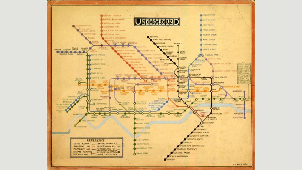
Henry Beck's Original Design

    We all know maps suck, and most of us have a hard time figuring them out. Even in our modern age where practically everyone has GPS in their pocket, it’s not uncommon to see someone hit a 180 because they just realized they’ve been walking the wrong way. The London Tube map is a unique exception to the rule of confusing maps; its sleek, simple, and nicely color-coded. Some have critiqued the London Tube map because of its lack of geographical accuracy, but the lack of concern for this aspect of its design is exactly what makes it so great (Graham-Smith, 2016). The purpose of a train map isn’t to accurately depict the layout of the trains within the city, or even to accurately display the distances between two stations; train maps exist to help passengers get from station A to station B. Beck knew that simplifying the twists, turns, and crookedness of the actual layout into something neater would make it easier for passengers get from station to station. At the time of its introduction, the top dogs of London transportation didn’t quite get this and rejected Beck’s initial offer for a redesign, even though he presented the idea during when Frank Pick was redesigning basically everything else (Transport for London | Every Journey Matters). Thankfully, Beck knew that he knew best (I am beginning to believe this is how most, if not all, designers feel) and insisted that they at least give his new design a shot at a trial run (Transport for London | Every Journey Matters). Turns out riders agreed with Beck, and the high approval rate for the new map lead to its official use by the Underground.  

            The London Tube map looks cool and is incredibly functional; you can’t ask for more from a design perspective. Its creation has not only redefined how Londoners move around the city via public transport, but its format has also spread around the globe to countless cities helping millions, maybe even billions, of people get where they need to go with ease (Graham-Smith, 2016). It has become an iconic symbol of London and served as a template for other cities to create their own versions. 


Sources:

BBC. (n.d.). The london underground map: The design that shaped a city. BBC Culture. Retrieved January 25, 2022, from https://www.bbc.com/culture/article/20150720-the-london-underground-map-the-design-that-shaped-a-city 

Graham-Smith, D. (2016, May 17). The history of the tube map. Londonist. Retrieved January 25, 2022, from https://londonist.com/2016/05/the-history-of-the-tube-map 

Transport for London | Every Journey Matters. (n.d.). Harry Beck's Tube Map. Transport for London. Retrieved January 25, 2022, from https://tfl.gov.uk/corporate/about-tfl/culture-and-heritage/art-and-design/harry-becks-tube-map

Comments

Popular posts from this blog

Floor Tiles from the House of Commons - Designed by A.W.N. Pugin